In general terms, 2016 will not be offering anything mind-blowing or game-changing with regards to visual communication. However, there are a few trends on the rise designers should be aware of.
Video Content is King
In the professional web design space, the biggest trend we see right now is the use of video. Video files have been sitting on stand by on YouTube and Vimeo for a long time. Then came the development of cross platforms like Hulu, HBO, Netflix, Amazon Prime, and the rise of smart TVs. With the massive use of video content, the development of faster online channels, and affordable CDNs, it was time for us designers to integrate videos into our work.
For digital agencies, video is such an interesting way to communicate, model, and extract new creative content. By using sound, moving images, animations, storytelling, and emotional components, video engages the human senses. It is the easiest, fastest, most direct way to tell a story and create a spontaneous connection between the brand and the viewer.
Web design can integrate videos in three ways:
Storytelling: Using video to narrate corporate stories, highlight products, or display TV ads. Those video files are typically featured as part of the user experience.
Video Backgrounds: Remember those large background headers so popular in website design in the last few years? Well, we expect to see them replaced by moving images. Instead of static photography, in 2016 designers will be integrating more and more moving backdrops, visually rich in content that will naturally draw the audience in.
Video Content: Tutorials, Lectures, VBlogs and similar video content will be high on demand and will grow exponentially in the next few years. Today, there is almost no news portal that uses only text and photos. Most text posts will be illustrated with video content.
The cost-effectiveness of the video is something left for discussion. Producing a proper video is a more expensive and lengthy process for agencies then organizing a custom photography session. On the other hand, nowadays anybody can record decent footage straight from a smartphone. It all comes down to having a solid plan, a creative idea, and the right message.
Storytelling
Crafting brand stories is a trend that has imposed itself in the last few years and has taken over the corporate world. Web designers can use storytelling in different ways:
Timeline Scroll
The designer can take us on a journey by presenting information gradually, following a logical or a creative path of details. This “long scroll” concept appeared as a trend 2-3 years back and has imposed itself as a natural way to discover information. With the birth of social media, news portals, or smartphones, people got used to reading news by scrolling up and down an infinite timeline feed.
Until we do not come up with something more interesting, the long scroll is here to stay and won’t be replaced in 2016-2017.
Intense Photography
Stock photography is no longer enough when building brand awareness. Striking images are far more likely to engage and lead to sales if they are tailored to specific customers. The photos designers will manipulate in 2016 should capture the brand’s soul and personality like never before. Image storytelling is a fantastic way to engage people’s imagination, create desire, and inspire.
Video Stories
As mentioned previously, 2016 will see the continuous growth of video content. Thanks to the development of technology, faster online channels, and affordable CDNs (content delivery networks), the Internet can now handle heavier files. This is what digital advertising has been waiting for a long time and web designers intend to take full advantage of video stories.
Layout, Colors, and Icons
Design is not only a beautiful wrapping of great content. In 2016, designers will keep the information flow dynamic and reflect the evolution of web technology.
Flat Design/ Cards Layout
Cards layout, popularized by Pinterest, is going to be one of the main web design trends in 2016. Cards layout represents units of information totally unrelated to one another and visually separated from other parts of the website. Each “card” may have a title, a picture, a video, or a link that takes viewers into a completely different part of the website. This layout (typically squares) is already in use to display social media content, products in an e-commerce shop, or blog posts.
Minimalism
There are fashion waves in web design that cycle through skeuomorphism (visual concepts created in real ways) back to ultimate minimalism (very abstract and simplified visualizations). It usually takes about 2-4 years for most web designs to align and start looking so identical that a new trend emerges.
Yelling Colors
2016 will bring the twilight of solid colors, simplified forms, and straight to the point information. In the last few years, content was the main focus that shaped designs. This is about to change. We are starting to see the come back of electric colors, sometimes used in dissonance from website’s harmony. We are going back in time in the style of Andy Warhol.
Rollover is (almost) Over
Rollover effects will be repositioned as eye-candy. For a very long time, rollovers were the way to navigate websites. The user would highlight a menu to see a submenu or highlight a panel and it would flip around to reveal more information. This is no longer valid on a mobile screen or touch device. Designers can keep the effect only to make UX elements interesting, yet not very functional.
Icons
Icon, pictograms, and infographics will be hot items in 2016. Icons are the fastest way to communicate information to customers with a short attention span. While people scan a page (in 1-2 seconds), the icons’ role is to stop viewers’ eyes on interesting content that grabs their focus. A text-only website stands no chance of being read without adding icons at key places.
In this noisy, fast-moving, visually rich online world, users are busy, on the go, and often scan through information instead of reading it. To reach them designers need to simplify, digest, and repackage as much information in a visual way. No more boring tables or pie charts either, think of using infographics instead.
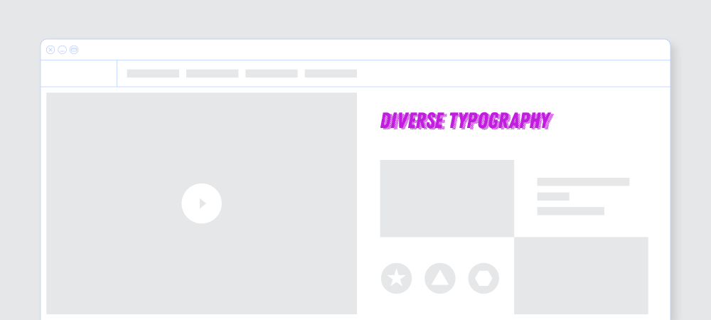
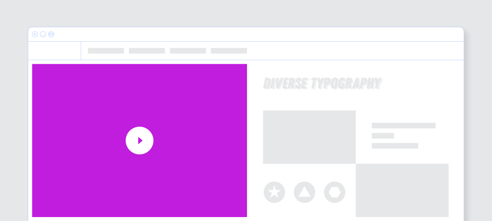
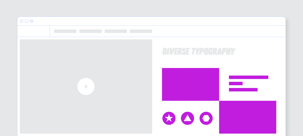
Diverse Typography
Using different typographic rules on the same page started about 2 years ago with the arrival of HTLM5 and the development of web fonts (the opportunity to use any arbitrary font without the need for the user to install the font on his computer to be able to read it).
There was a time when building web design included 2 fonts (the most). Today we see up to 3-4 typographies being used together, and each of those fonts is mixed with bold, thin and italic. We’re picking up on the old 90ties design poster trend. Website typography is becoming quite diverse, with fonts putting additional accents to content.
Being able to mix different fonts is a real skill in the web design world. We will see this skill being developed next year.
If your brand is looking for a reliable partner, get in touch with us. We love co-creating fantastic projects with clients from across the globe.